Introduction
In our data-driven world, information is abundant and constantly evolving. Yet, the true power of data lies not just in its collection but in its interpretation. Visualization becomes paramount as it transforms complex datasets into understandable insights. This article, Visualizing the Data: The Role of Graphs in Descriptive Statistics, focuses on how effective graphs play an essential role in revealing meaningful stories within the numbers, aiding both decision-making and understanding.
Imagine a business boardroom where executives are confronted with countless spreadsheets. Now, picture a simple, colorful graph summarizing that data. Instantly, clarity emerges. The graphs simplify the complex, spotlight trends, and facilitate discussions—making the role of graphs in descriptive statistics not just relevant but revolutionary.
The Importance of Descriptive Statistics
To fully grasp the Visualizing the Data: The Role of Graphs in Descriptive Statistics, it’s essential to first understand what descriptive statistics entail. Descriptive statistics summarize and organize characteristics of a dataset. It provides a glimpse into that data through measures such as mean, median, mode, and standard deviation.
However, raw numbers can be daunting. Here are some statistics that underscore their importance:
- Cognitive Science Studies: Research shows that visuals are processed 60,000 times faster than text.
- Retainment Rate: People often retain 65% of the information when it’s paired with images versus merely 10% when using text alone.
In this context, graphs act as visual storytellers, offering clarity and deeper understanding.
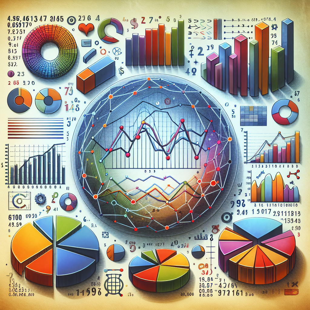
Types of Graphs in Descriptive Statistics
1. Bar Graphs
Bar graphs provide a straightforward comparison between different groups. They are incredibly effective at showing categorical data.
Case Study: Sales by Region
A retail company used a bar graph to represent its sales data across various geographic locations. The visualization highlighted the underperforming regions, guiding marketing efforts and resource allocation.
2. Pie Charts
While often debated among analysts, pie charts can efficiently show parts of a whole.
Example: A non-profit organization used a pie chart to display its budget allocation. Stakeholders could easily see how funds were divided among various initiatives.
3. Histograms
Histograms are invaluable for depicting frequency distributions of continuous data.
Case Study: Age Distribution
A health organization employed a histogram to illustrate age distribution among its patients, revealing trends that informed health campaigns.
4. Scatter Plots
Scatter plots are essential in illustrating relationships between two quantitative variables.
Example: A university used scatter plots to investigate the correlation between hours studied and exam scores, leading to insights into effective study habits.
5. Line Graphs
Line graphs track changes over time and are useful for showing trends.
Case Study: Stock Prices
An investment company implemented line graphs to display stock performance over several years, making it easier for investors to identify trends.
The Visual Storytelling Process
The process of Visualizing the Data: The Role of Graphs in Descriptive Statistics goes beyond merely creating a graph. It involves:
- Understanding the Data: Analyzing what data you have and what story you aim to tell.
- Choosing the Right Graph: Selecting a format that best represents your data and facilitates understanding.
- Design for Clarity: Using colors, labels, and legends optimally to ensure clarity.
- Interpreting the Graph: Providing insightful commentary that drives home the graph’s message.
Best Practices for Creating Effective Graphs
1. Simplicity is Key
Graphs should be straightforward and devoid of unnecessary embellishments. A clutter-free graph enhances understanding, making it easier to interpret data.
2. Opt for Accurate Scales
Misleading scales can distort the viewer’s perception. Always present scales that accurately reflect the data.
3. Use Color Wisely
Colors can convey emotions and importance, but overuse can be distracting. Stick to a coherent color scheme that enhances readability.
4. Consistent Data Labels
Ensure that labels and units are consistent throughout the graph to avoid confusion.
5. Incorporate Annotations
Use annotations to emphasize critical data points or trends, guiding the viewer’s focus to what matters most.
The Impact of Visualizing the Data: The Role of Graphs in Descriptive Statistics
Graphs offer a plethora of advantages in descriptive statistics:
- Enhanced Understanding: They break down complex data into digestible parts.
- Quick Insights: Visuals allow for rapid analysis, identifying trends and anomalies almost instantaneously.
- Audience Engagement: Graphs create engagement in presentations and reports, making audiences more likely to absorb the data.
Conclusion
In sum, Visualizing the Data: The Role of Graphs in Descriptive Statistics is an indispensable aspect of data analysis. By utilizing graphs, you capitalize on the power of visual storytelling, making insights more accessible and decision-making more informed.
As you embark on your journey of data visualization, remember that each graph serves not only as a data summary but as a bridge connecting numbers to actionable insights. Embrace the art of graphing, and you’ll find yourself not only presenting data but revealing the stories behind it.
FAQs
1. Why are graphs preferred over tables in descriptive statistics?
Graphs are visually intuitive and allow for immediate understanding of trends, contrasts, and patterns, whereas tables often require deeper analysis of numbers.
2. What types of data are ideal for bar graphs?
Bar graphs are perfect for categorical data, where you need to compare distinct groups.
3. Are pie charts still effective in modern data visualization?
While they can oversimplify, pie charts can still be effective for small datasets to show parts of a whole when used appropriately.
4. How can I ensure my graphs are accessible to everyone?
Use high-contrast colors, clear labels, and alternative text descriptions for visualizations used in web formats.
5. What software tools are recommended for creating graphs?
Tools like Microsoft Excel, Tableau, and Python’s Matplotlib library are excellent for creating a wide variety of graphs with ease and precision.
By integrating these insights and practices into your work, you’ll harness the power of visualizing data, guiding you and your audience to a deeper understanding of the data-driven world. Whether you’re a data analyst, business leader, or educator, leveraging the role of graphs in descriptive statistics is an ultimate step toward effective communication and insightful decision-making.