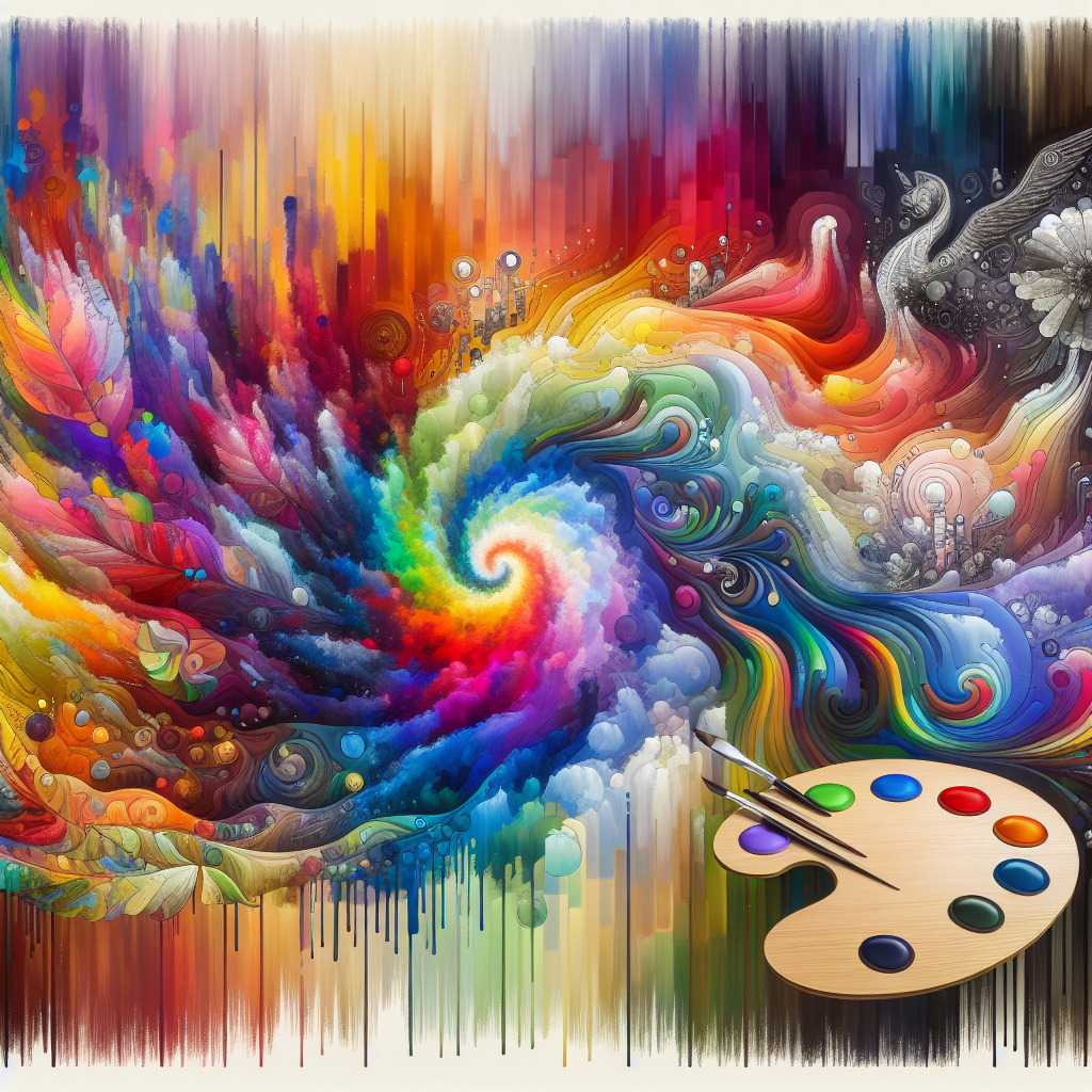
Introduction
In a world saturated with imagery, the way we perceive art and design has become increasingly pivotal. The interplay between color and composition significantly shapes our emotional responses and cognitive interpretations. As creators, understanding how visual attention influences art and design is essential for crafting works that resonate deeply with audiences. This article will explore the rich territory spanning from color theory to visual composition, shedding light on their crucial roles in capturing and directing visual attention.
Understanding Visual Attention
Visual attention is the cognitive process of selectively concentrating on specific aspects of a visual scene while ignoring others. But why does it matter inart and design? Simply put, our ability to focus on different elements influences how we process and interpret images. Whether it’s the bold pop of a color against a muted background or the arrangement of elements in a layout, each choice impacts how the viewer engages with the work.
Case Study: The Impact of Color in Branding
Consider the case of Coca-Cola. The brand’s signature red is not merely a design choice; it’s a psychological strategy. Research shows that red stimulates excitement and passion, leading to increased impulse purchases. Coca-Cola’s choice of color is not just about aesthetics—it’s a calculated decision to capture visual attention and evoke specific emotions.
The Science of Color Perception
Color perception is deeply rooted in science. It can evoke emotions, influence behavior, and even affect our physiological state. Understanding this can significantly enhance art and design practices.
Color Theory: A Brief Overview
Color theory encompasses the principles of how colors interact and the emotional responses they invoke. Here are key components:
- Primary Colors: Red, blue, and yellow, which cannot be created by mixing other colors
- Secondary Colors: Green, orange, and purple, formed by mixing primary colors
- Tertiary Colors: A combination of primary and secondary colors
Using tools like the color wheel, artists and designers can deeply understand how colors relate and affect perception.
Table: Emotions Associated with Colors
| Color | Emotion | Design Application |
|---|---|---|
| Red | Excitement | Calls to Action buttons, sale signs |
| Blue | Trust | Banking apps, corporate branding |
| Yellow | Happiness | Children’s products, playful designs |
| Green | Calm/Relaxation | Health and wellness branding |
| Black | Sophistication | Luxury brands, high-end products |
The Role of Composition in Visual Attention
While color captures attention, composition ensures that it holds. Composition refers to how elements are arranged in a piece of art or design. It dictates flow and guides the viewer’s eye.
Fundamental Composition Techniques
- The Rule of Thirds: Dividing an image into thirds both horizontally and vertically, placing focal points at the intersections to create balance.
- Leading Lines: Using lines to lead the viewer’s eye through the artwork, creating a journey within the composition.
- Symmetry vs. Asymmetry: Symmetry often evokes a sense of harmony, while asymmetry can create dynamic engagement.
Case Study: The Apple Website Design
Apple’s website is a prime example of effective composition. The minimalist layout guides users through the website, placing products as focal points against ample white space. This design captures attention through strategic use of color and a carefully constructed composition, exemplifying the balance between simplicity and function.
Exploring the Interaction: From Color to Composition
When considering "From Color to Composition: How Visual Attention Influences Art and Design," it’s crucial to understand that these elements are not independent. They interact in ways that amplify their effectiveness.
Color Use in Composition
Visual attention is often first caught by color. For instance, a vibrant blue box in an otherwise muted design can stand out, drawing attention to a call to action.
Chart: Color Use in Visual Attention
| Color | Percentage of Attention Captured | Recommended Use |
|---|---|---|
| Bright Red | 57% | Alerts, warnings |
| Soft Pastels | 25% | Backgrounds, calming designs |
| Dark Shades | 18% | Text, grounding components |
Designing for Engagement
Creating art and designs that resonate requires thoughtful integration of these principles. Here are key strategies:
- Contrast: Utilize contrasting colors to highlight important elements. High contrast can draw immediate visual attention.
- Hierarchy: Establish a visual hierarchy using size and color to guide the viewer’s eye. Larger, bolder elements will capture more attention.
- Emotion-Driven Choices: Select colors based on the emotional response you wish to evoke. Consider your audience and what feelings they might associate with particular colors.
Conclusion
In exploring "From Color to Composition: How Visual Attention Influences Art and Design," we discover that the relationship between color and composition is foundational to effective visual communication. Both elements work synergistically to capture attention, evoke emotions, and guide the viewer through a narrative.
As creators, we are empowered to harness these insights to produce compelling works that not only attract but also engage our audience on a profound level. Remember, the next time you create, consider not just what colors to use or how to lay them out, but how these decisions interact to maximize visual attention and resonance.
FAQs Section
1. How can I effectively choose colors for my design?
Choose colors that reflect the emotions you want to evoke. Use a color wheel to help determine complementary colors and ensure harmony.
2. What should I prioritize: color or composition?
Both are crucial. Start with color to capture attention, but ensure your composition sustains engagement.
3. How does cultural perception affect color choices?
Colors can have different meanings in different cultures. Research your target audience’s cultural associations with colors to inform your choices.
4. Can I use multiple colors in one design effectively?
Yes! Use contrasting colors strategically to highlight key elements, but maintain balance to avoid chaos.
5. Is there a right or wrong way to use the Rule of Thirds?
While the Rule of Thirds is a guideline, it’s not a rule set in stone. Experiment with other compositional techniques to find what works best for your piece.
By understanding the dynamics of color and composition, we can create visually captivating works that truly resonate—transforming attention into engagement in the artistic and design landscape.